Building a Clear Label Family Across Automotive Care Products
A Himax portfolio set showing how product labels were adapted across sachets, trigger bottles, aerosol cans and tubes while keeping the range recognisable. The visuals on this page are presentation mockups of Jprint Studio's label and packaging artwork.
 Product-family visualisation
Keep the family recognisable without forcing every pack into one layout
A sachet, trigger bottle, aerosol can and dispensing tube do not offer the same proportions or viewing conditions. Each format needs a hierarchy that suits its shape while still feeling like part of one automotive-care range.
The design system uses strong product naming, purposeful vehicle imagery and repeatable brand cues. Those anchors stay consistent while the content and composition adjust around each container.
- 01Range-level visual direction and brand recognition
- 02Product name, benefit and use-case hierarchy
- 03Artwork adaptation for different pack proportions
- 04Presentation mockups for reviewing the finished context
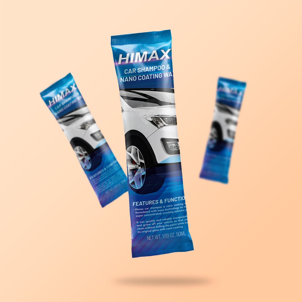
Make a small pack readable at a glance
The sachet gives the product name and vehicle application the strongest visual weight. Supporting features are kept within a controlled lower section so the pack remains energetic without becoming difficult to scan.
The repeated blue and black structure also allows multiple sachets to read as one range when displayed together.

Use the container shape as part of the hierarchy
The trigger-bottle label uses a bold product name and high-contrast colour field to establish the purpose quickly. Application cues sit below the main message, where they support rather than compete with recognition.
Planning the label within the actual bottle silhouette helps avoid a composition that looks balanced only on a flat artboard.
One visual language, two very different containers
Cylindrical and tall dispensing formats change where customers see the brand and how much information can remain visible at once. The artwork keeps product identity prominent while adjusting the imagery, reading order and usable panel area for each pack.
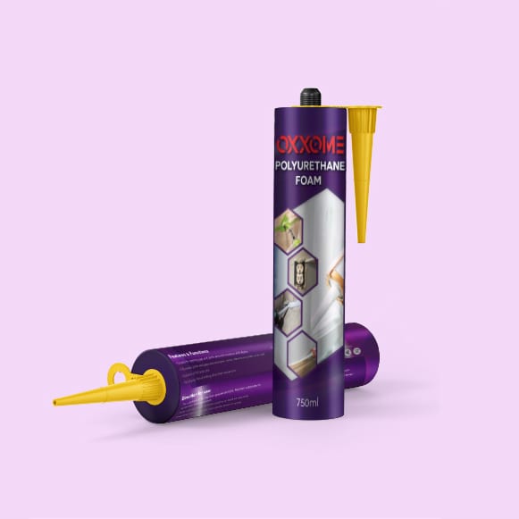

A product family needs rules that can flex
Consistency does not mean making every label identical. A useful packaging system defines the brand anchors that must stay recognisable, then gives each format enough freedom to communicate clearly on the finished object.
Continue from the part of the project you need
Need labels that stay clear across several products or formats?
Share the products, container dimensions, variants, approved copy, available brand files and intended material. Jprint Studio can develop the visual system and prepare artwork for the agreed production route.