Coordinating Product Graphics Across Packaging, Brochures & Retail Display
A Glean portfolio set showing how product communication was designed and adapted for practical physical and digital formats. Jprint prepared the production-ready artwork files; the client coordinated printing with its own suppliers.
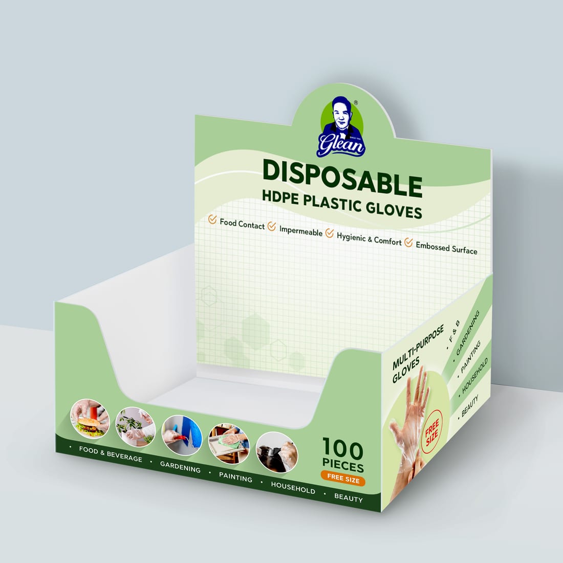 Retail display
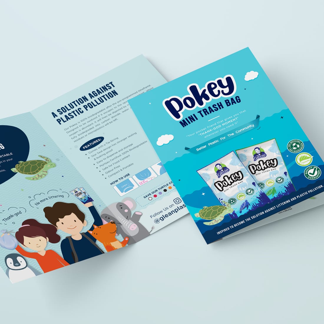 Printed brochure
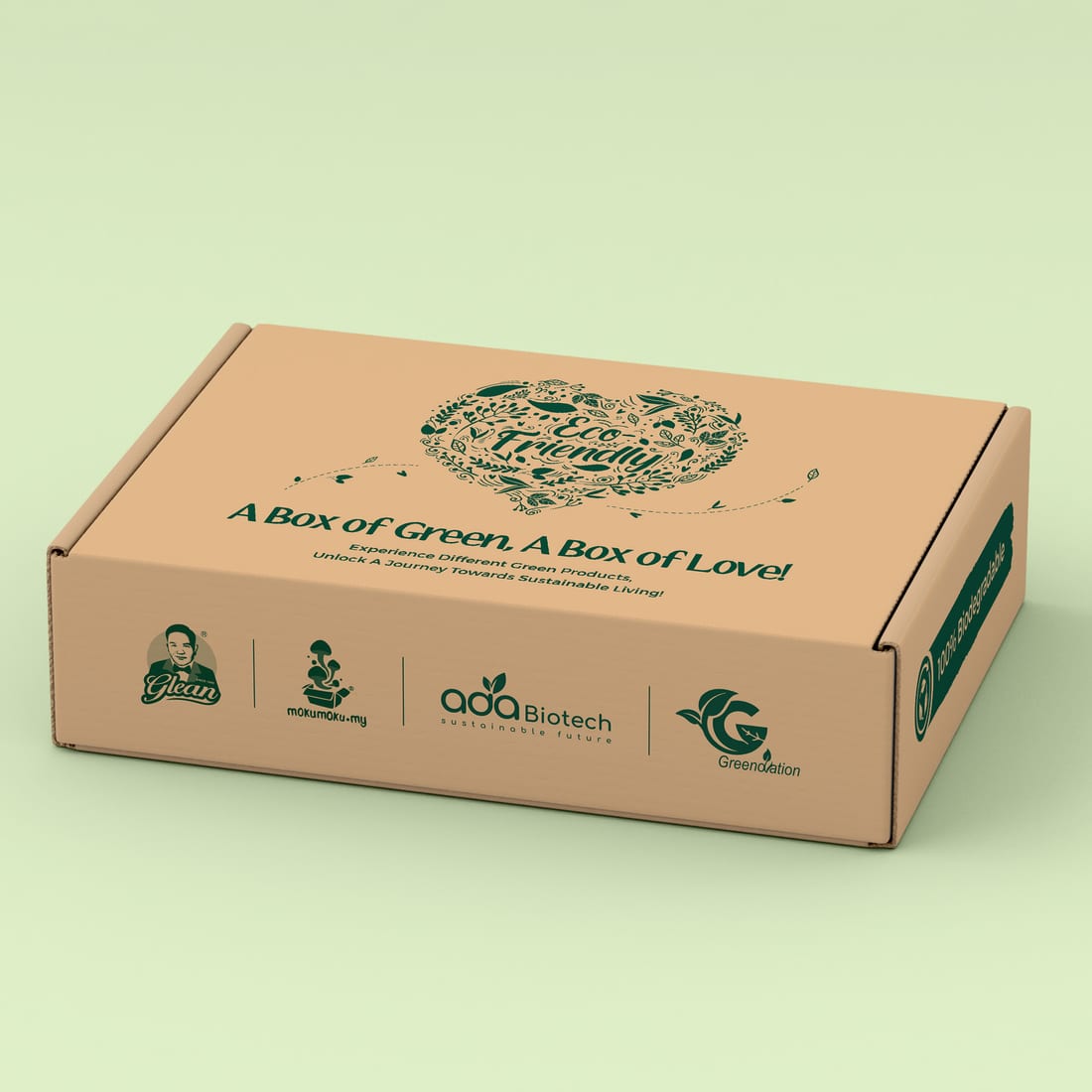 Presentation box
One product message, several very different viewing conditions
Product communication has to remain clear when it moves from a screen to a brochure, box or retail display. Each application changes the reading distance, available space, content density and physical constraints.
The solution was not to copy one layout into every format. The product hierarchy and visual character remained recognisable, while each piece was reorganised around how customers would actually encounter and use it.
- 01Retail display artwork for disposable gloves
- 02Printed product brochure for the Pokey range
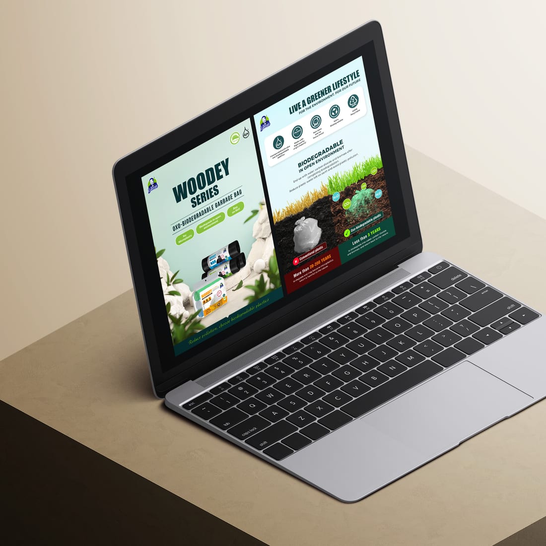
- 03Digital brochure pages for the Woodey range
- 04Branded presentation box for a green-partner set
Fast recognition at the point of sale
The display tray gives the product name and purpose immediate priority, then uses concise application cues and quantity information to support a quick retail decision.
The layout also accounts for folds, edges, the product opening and the physical shape of the finished display, not just the visible front panel.
More space for explanation
The Pokey brochure shifts from shelf-level recognition to a more detailed sales conversation. Product benefits, use instructions and environmental messaging are organised across front and back layouts.
The brighter campaign character remains visible without competing with the information a customer needs to understand the product.
Information designed for a screen
The Woodey brochure uses a clear side-by-side structure for laptop and screen viewing. Product visuals, feature icons and biodegradability information are arranged so the key points can be understood without relying on a printed handout.
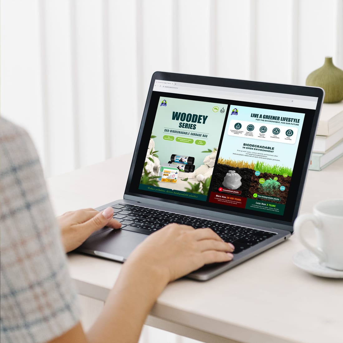
Brand relationships made visible
The green-partner box brings several partner identities into one restrained presentation. Natural board colour and single-colour artwork create a practical outer pack while keeping every participating brand legible.
The result feels coordinated without forcing the partner marks into an artificial shared identity.
Consistency is an adaptation system, not a copied layout
A logo alone does not create consistency. Product graphics need to respond to the finished object, reading distance, amount of information, material and production method. Planning those decisions together produces a clearer customer experience and fewer artwork problems before output.
Continue from the part of the project you need
Need product artwork that works across more than one format?
Share the product, required applications, available brand files, quantity and deadline. Jprint Studio can design and prepare production-ready artwork for brochures, packaging, labels, displays and other business materials.