Practical checklist for product businesses
Packaging and Label Artwork Checklist Before Printing
Check the physical product, size, material, content, codes, colours, production layers, variants and final proof before approving artwork.

Quick answer
What should you check before printing?
The printer's confirmed job specification takes priority over a generic checklist. Materials, machines, shapes and finishing methods can require different file preparation.
- 01Physical product, container and final dimensions
- 02Current dieline or die-cut shape
- 03Material, adhesive and usage conditions
- 04Approved product copy and required information
- 05Barcode, QR code and variable data
- 06Colour references and opacity requirements
- 07Bleed, folds, cuts and finishing zones
- 08Every flavour, size, language and SKU
- 09A proof viewed at the intended size
- 10One clearly identified approved file
Packaging artwork needs to do more than look attractive on screen. It must fit the physical product, remain readable at the finished size, work with the selected material and carry the correct information across every product variant.
Checking these details before production reduces avoidable revisions, proofing delays and reprints.
Complete checklist
Review the artwork in ten practical steps
Confirm the physical product
Work from the exact bottle, jar, pouch, box or pack rather than an estimated photograph. Confirm the usable flat area, surface shape, lids, handles, windows and areas that must remain visible.
Also explain how the product will be filled, packed, stored and displayed. A physical container sample is useful when fit and proportion matter.
Check the final size or dieline
Changing size late can affect readability, image cropping, margins, code placement and alignment across panels. Use the latest supplier-approved dieline when the format requires one.
Keep cut, fold, crease, seal, window and no-print information identifiable. Confirm before redrawing or scaling any production template.
Match the material to real use
Tell the production team about refrigeration, condensation, moisture, oil, chemicals, frequent handling, outdoor exposure, temperature changes and the surface shape.
Also state whether the application should be permanent or removable and whether the material should appear white, transparent, metallic or kraft-coloured. These details affect material, adhesive, lamination, opacity and print recommendations.
Finalise the product information
Prepare one approved source of truth for product names, pack size, ingredients or materials, instructions, warnings, batch or expiry fields, codes, certification marks and company details.
The business placing the product on the market remains responsible for confirming content accuracy and regulatory suitability. Jprint can organise supplied information but is not the final regulatory approver.
Selected work
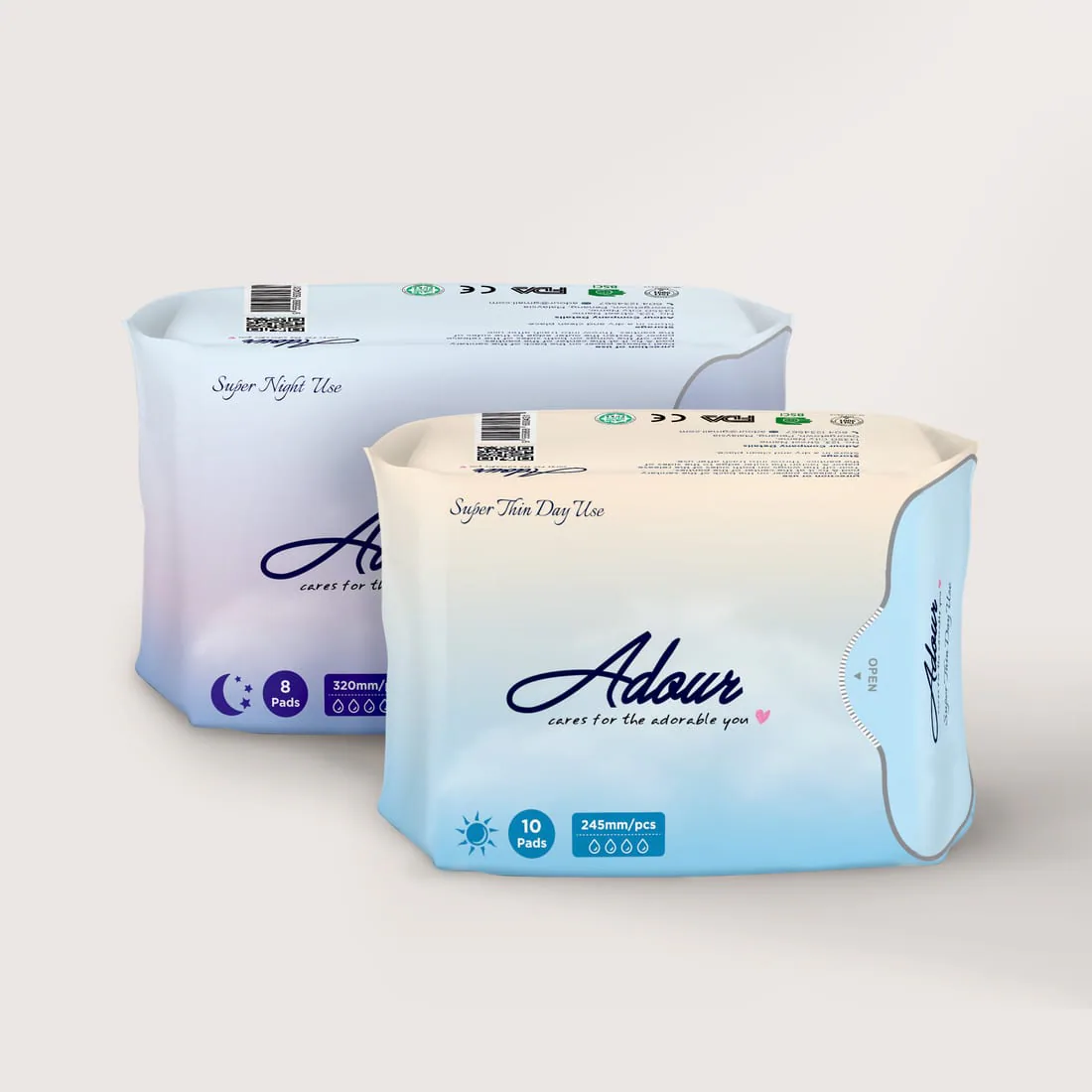
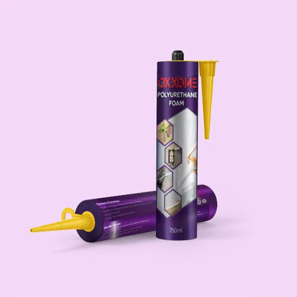
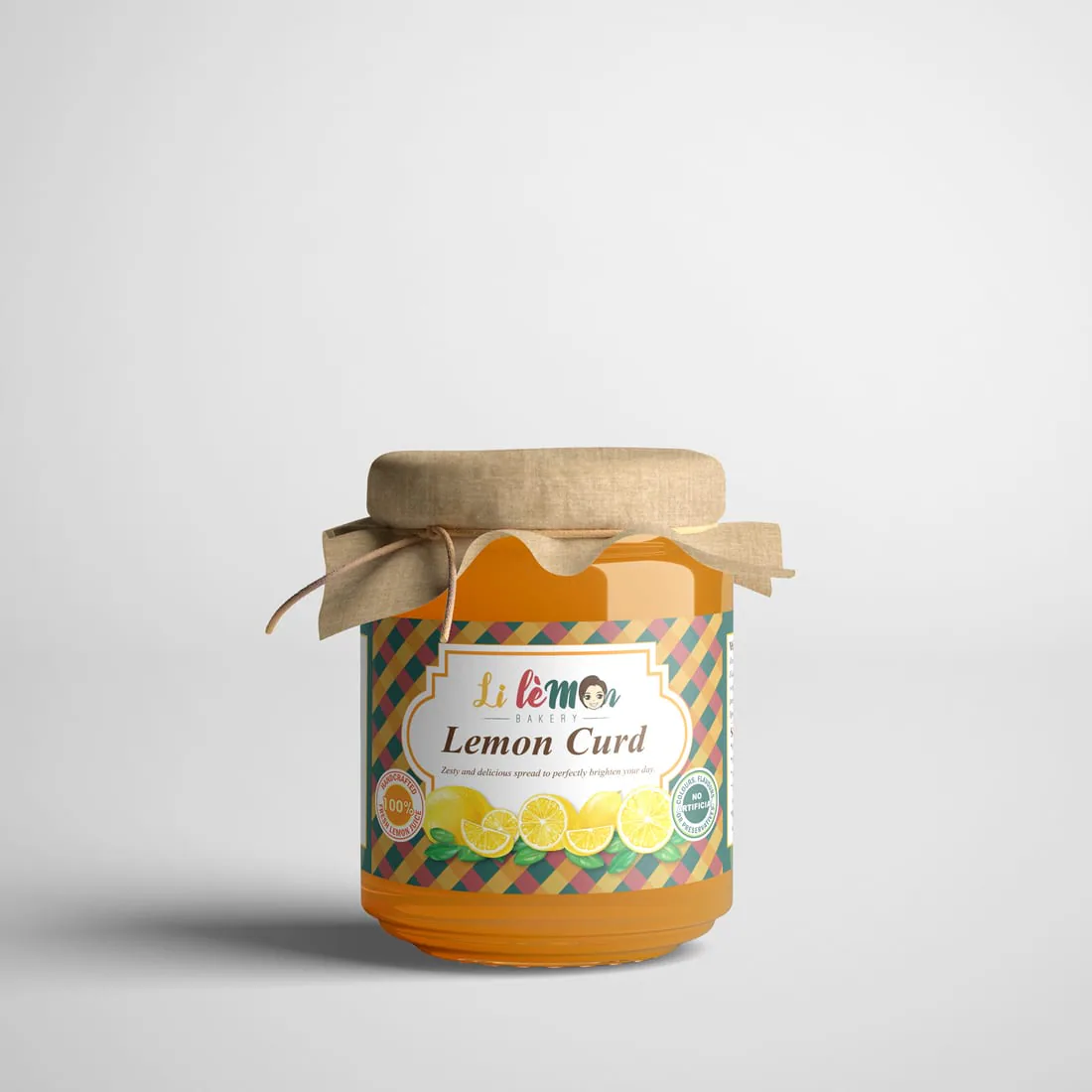
Label artwork in its final product context
Good production files are only the beginning. The finished pack still has to look clear, consistent and credible.
Protect readability at finished size
Review the artwork at actual size. Check that the product name is easy to identify, essential information is not crowded, small text remains readable and light text has enough contrast.
Keep important content away from cuts, folds, strong curves and other production-sensitive areas. Confirm fine type, lines and reversed text against the job specification.
Test barcodes and QR codes
Use only final approved data. Check the destination or product record, clear area, placement, contrast and intended printed size. Avoid folds, seams and strong curves.
Print a test at the intended size and scan the proof using more than one suitable device when practical. Reflective material, lamination and curved containers can change real-world performance.
Confirm colour and opacity
Screen colour is not a physical print proof. Substrate, ink system, lamination and surrounding colour can change the finished appearance. Provide an approved reference for brand-critical colours.
For transparent material, identify what should remain clear and what requires opacity. Where the selected process uses white ink, its production layer must be planned and separated correctly.
Organise production elements
Separate visible artwork from technical information. Depending on the job, this can include dielines, cut paths, folds, white ink, varnish, foil, windows, transparent areas and variable information.
Follow the production provider's naming and layer requirements. Do not rely on colour alone to explain whether a technical element should print.
Control every product variant
Use a controlled list for product name, flavour or model, pack size, SKU, barcode, language, revision date, file name and approver.
Compare every artwork file with that list. A change to the front name may also require different ingredients, instructions, quantity, colour coding and code data.
Approve one exact proof
Read every line again, check names and numbers, compare codes with the source list, view at actual size and confirm the production specification, quantity and variants.
Record who approved the file and when. Avoid approving from a compressed message screenshot or choosing between several files all named final.
File handover
What should you send for packaging or label design?
Practical handover list
- Editable approved product copy
- Product and variant spreadsheet
- Original vector logo files
- Brand guidelines and colour references
- Original high-resolution images
- Latest supplier-issued dieline, when required
- Final barcode, QR-code files or verified data
- Required certification or compliance marks
- Physical container or accurate dimensions
- Previous artwork that must be matched
Variant control
Keep one record for every SKU
A controlled variant sheet makes similar-looking files easier to compare and approve.
Choose the right support
Design, production or artwork adaptation?
Packaging design
Choose this when the project needs a visual concept, hierarchy or coordinated family across products.
Explore Packaging DesignProduct label printing
Choose this when the artwork is approved and the project needs a suitable label production route.
Explore Product Label PrintingArtwork adaptation
Choose this when an approved design needs resizing, versioning, rebuilding or production setup.
Explore Artwork AdaptationBefore approval
Common artwork mistakes to catch
- Designing before the container or dieline is confirmed
- Copying content from an outdated product version
- Using different codes in the spreadsheet, artwork and proof
- Placing important text too close to a fold, curve or edge
- Supplying only a flattened low-resolution image
- Assuming transparent material makes every colour opaque
- Approving colour only from a phone or monitor
- Mixing technical instructions with visible artwork
- Sending several files named final without an approved version
- Adding a variant without checking every changed field
Frequently asked questions
Questions product businesses often ask
Do I need a dieline for a product label?
Simple labels may only need a confirmed finished size and shape. Structural packaging, custom shapes and artwork crossing folds or panels may require an approved production dieline before the design is finalised.
Can Jprint help choose a label material?
Yes. Share the container, surface, usage conditions, quantity and desired appearance. The suitable recommendation depends on the specific product and production route.
Should label artwork be CMYK?
Many print workflows use CMYK, but the correct colour setup depends on the selected process, substrate and any spot-colour or white-ink requirement. Confirm the job specification before final export.
Can a QR code be made smaller to fit the design?
Do not reduce a code based on appearance alone. Test it at the intended printed size, contrast, material and placement, and follow the requirements of the code system being used.
Who checks ingredients and required label wording?
The business supplying and approving the product content is responsible for its accuracy and regulatory suitability. The designer should work from approved information and flag obvious inconsistencies but is not the final regulatory authority.
Preparing a label or packaging project?
Send the product, container, size, quantity, variants, usage conditions and deadline.
Jprint Studio can help identify whether the project needs packaging design, artwork adaptation or label production.